Mango
The Challenge:
MangoRx was conceived with the intention of flipping the cultural norms and stigmas around men’s health and breaking down barriers for people looking for easier, more affordable alternatives to traditional healthcare.
We worked with the founders to craft an entirely new kind of health brand that’s fun, honest, and approachable, so men everywhere could feel confident about taking control of their needs.
Our Approach:
We had to convey a large amount of information on an often uncomfortable and unreliable topic in a digestible, friendly, and trustworthy manner.
To rise to the occasion, we assembled a full creative blitz to create an experience, tone, and brand that would normalize both seeking information about men’s health issues and proactively doing something about them. The result: a bold and bright brand experience that captures confidence and surely a smile.
Brand Strategy
Our strategy from the beginning was to be direct and no-nonsense with our customers. We helped Mango find a way to speak to their audience in a fresh, fun, non-robotic voice—one that stood out from all of their competitors…no offense to other telehealth companies, but, y’know.
We developed a humorous, conversational tone that is backed by science, allowing people to dig deep for the information if they choose. It was important to
communicate to customers that this is a real prescription medicine that delivers real results, and mangorx.com is a place customers can trust to learn all about it.
At the same time, we think humor is empowering, so we dialed up the bravado, play, and cleverness; allowing them to strategically communicate how they’re outthinking the one-pill-fits-all solutions of their competitors.
Brand Identity
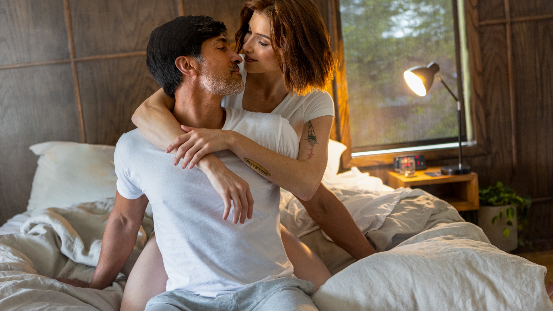
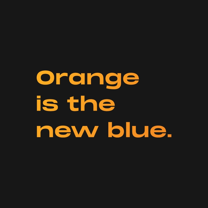
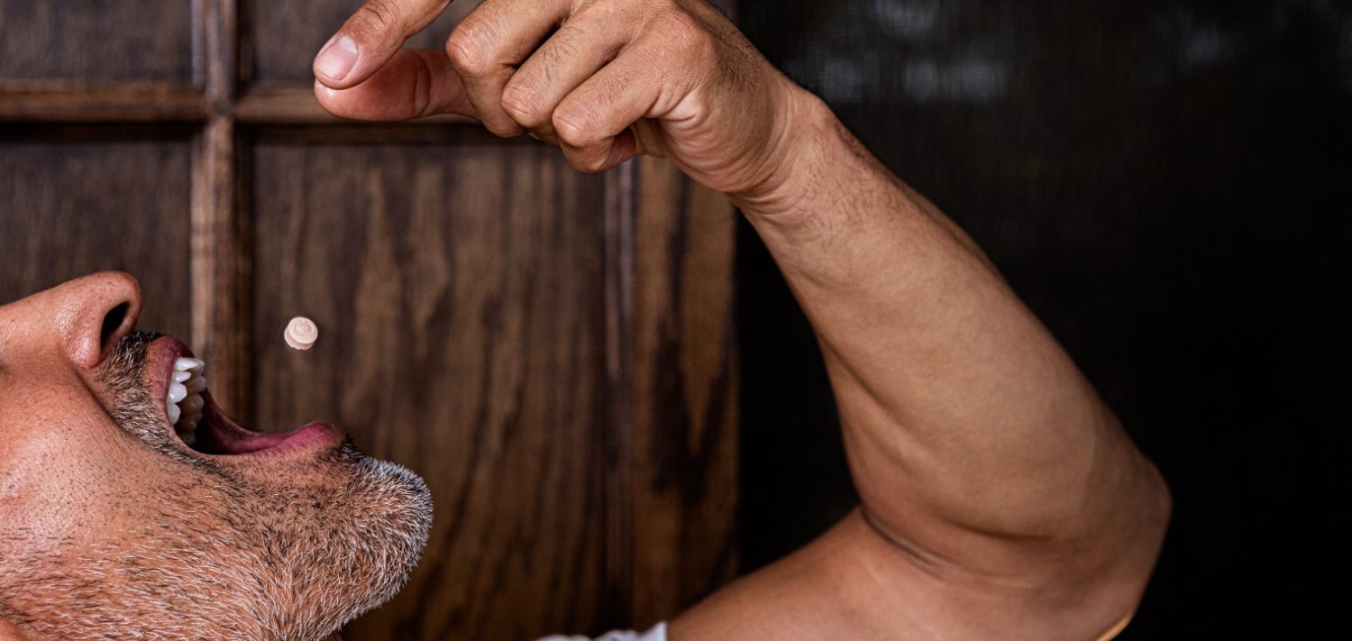
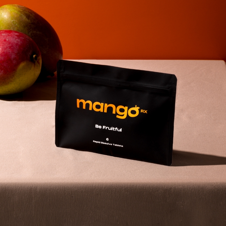
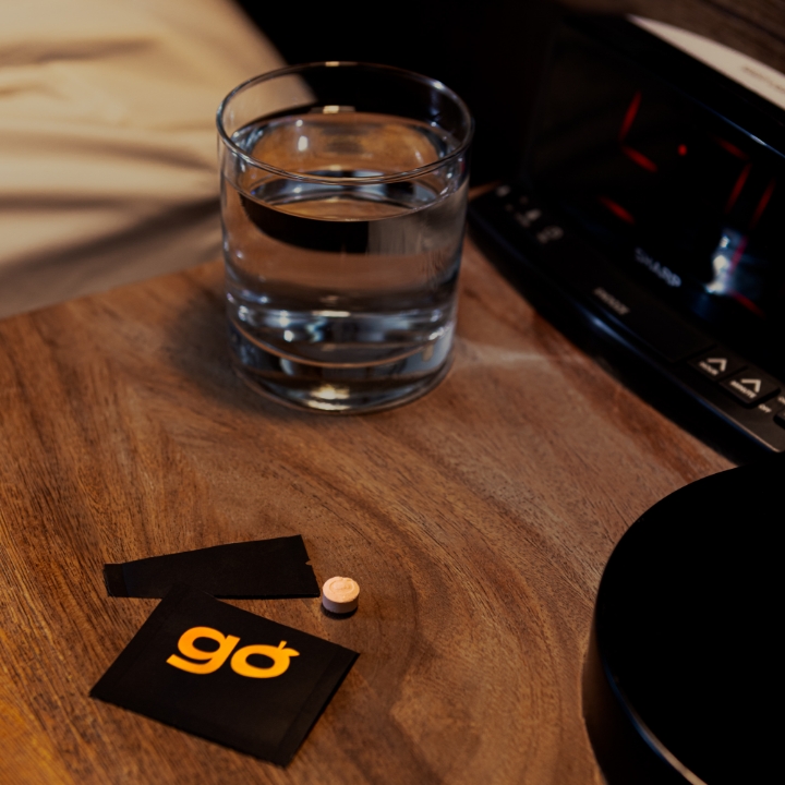
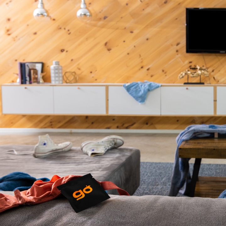
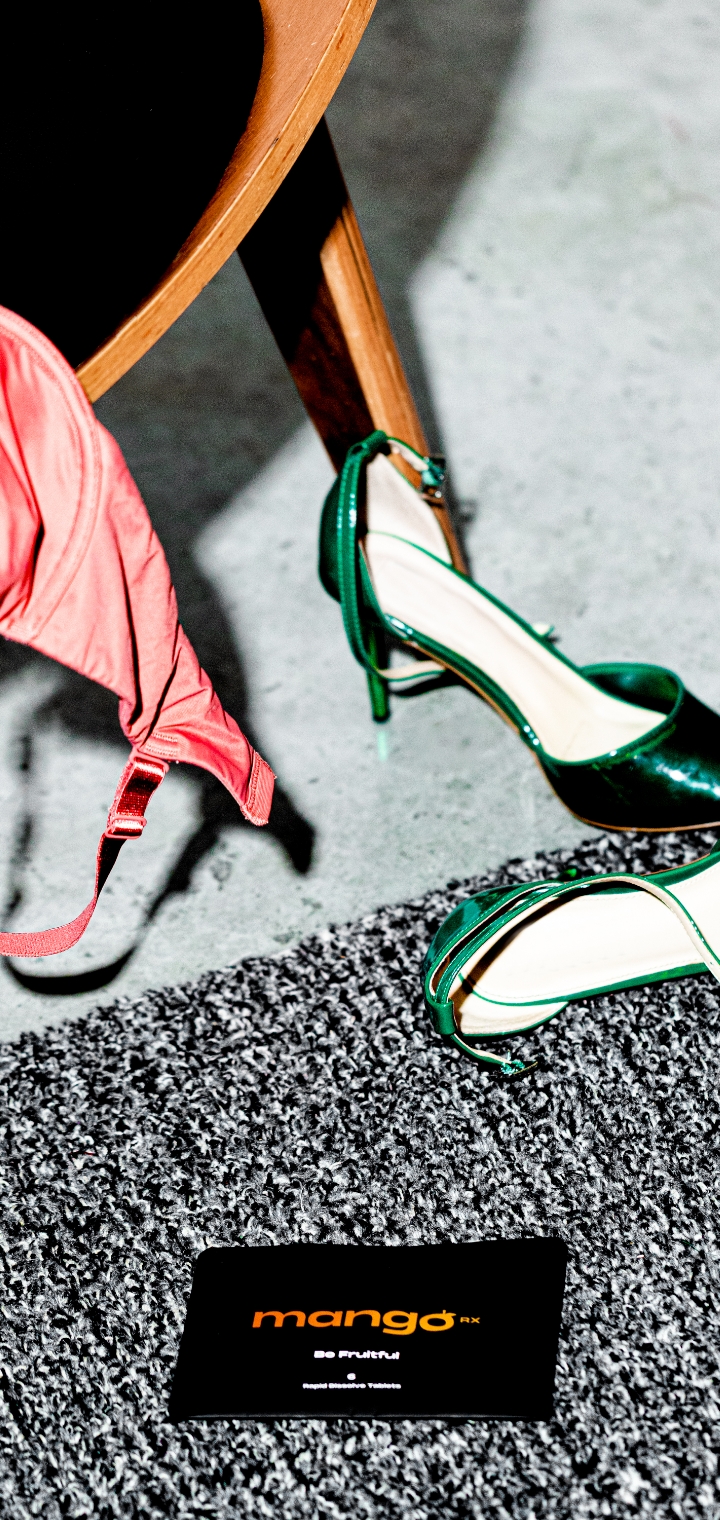
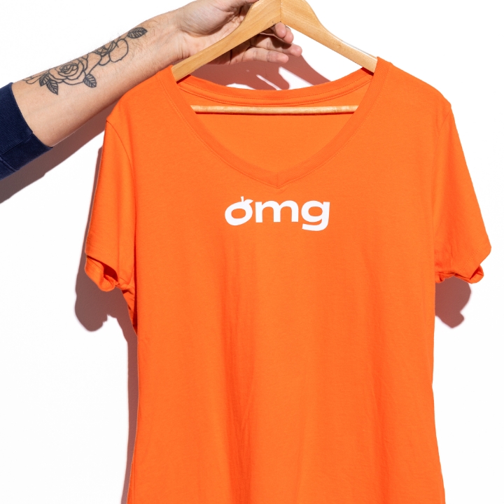
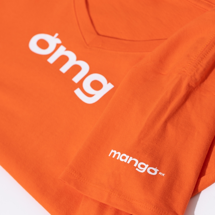
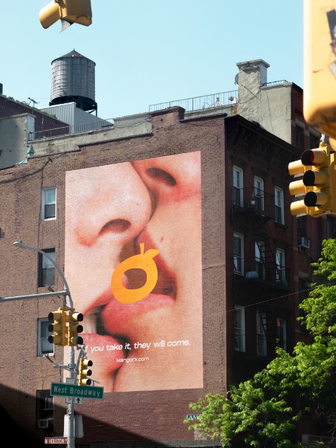
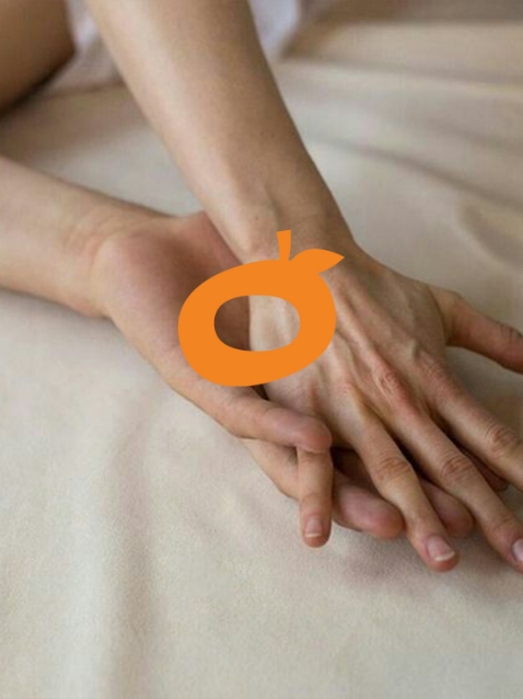
We decided early on that Mango should focus on showing normal men at their best—and celebrate the pleasures that come from prioritizing your sexual health. The creative direction strives to be fresh, as well as eye-catching, and honest. We implemented a bold logo and colors, along with fruitful visual metaphors, as a personable way to show the product’s benefits.
We helped the Mango team maintain consistency of art direction for a multitude of visual mediums, including content production partners, ensuring all brand touchpoints shared the same energetic vibe and aspirational tone. From this combination emerged a brand that’s authoritative, effective, and attention-grabbing. And that’s a triple threat.


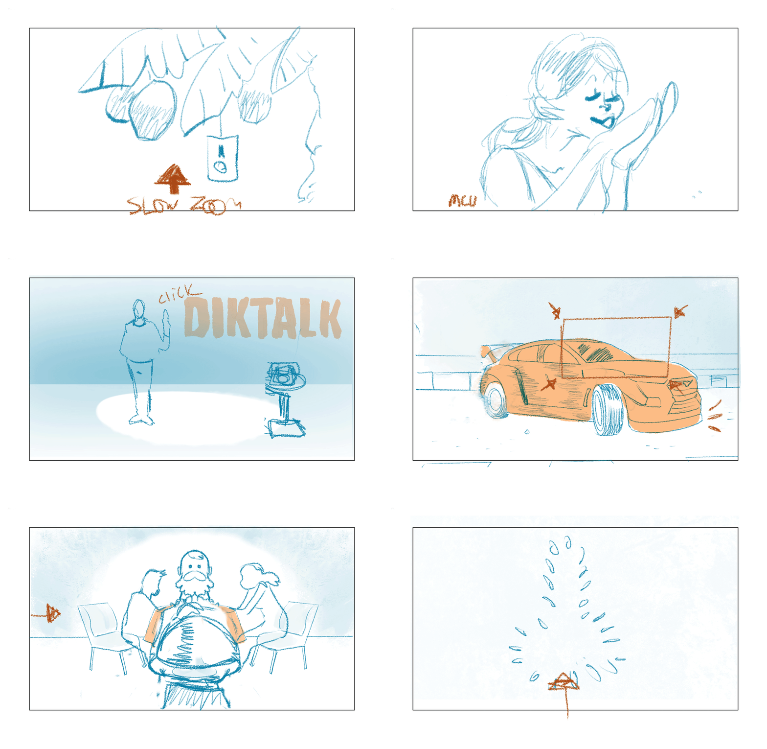
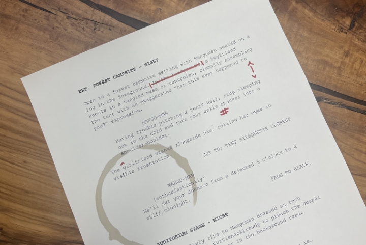
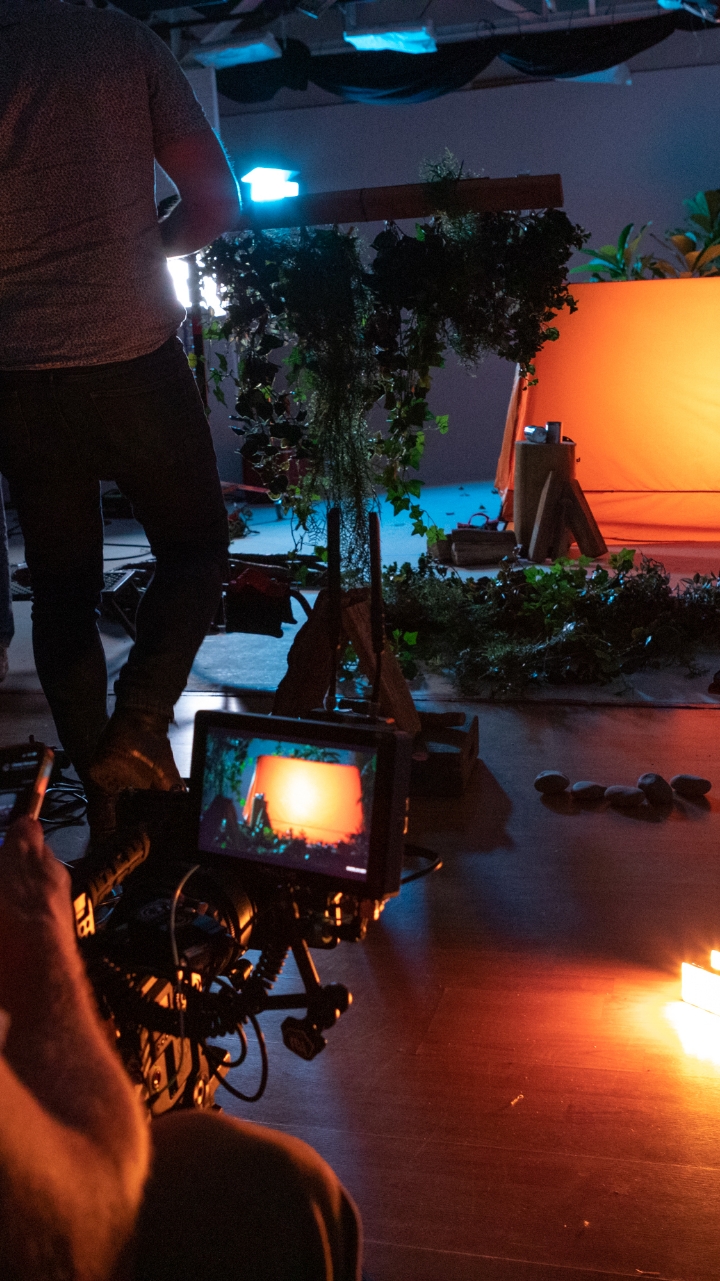
The debut brand video, titled “Make Every Day Hump Day With MangoRx,” emphasizes a more approachable and modern sense of self-care for men in a fresh and tongue-in-cheek voice.

Product & Web Design
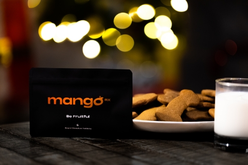
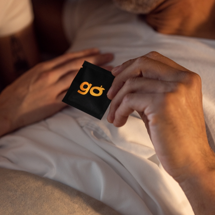
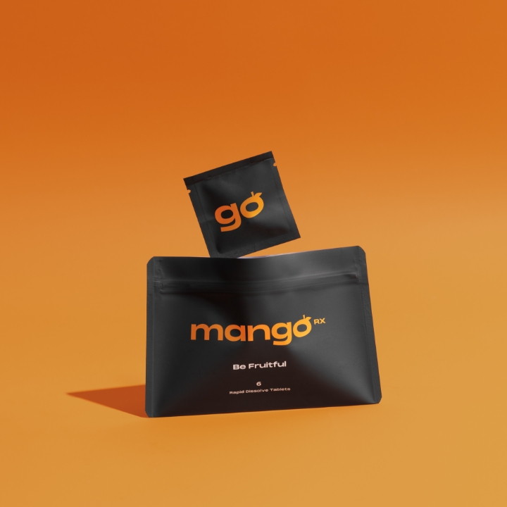
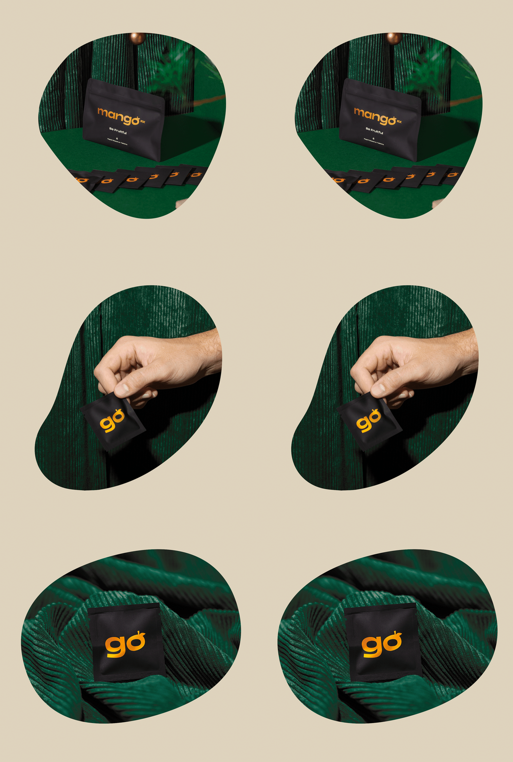
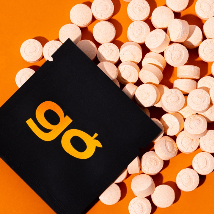
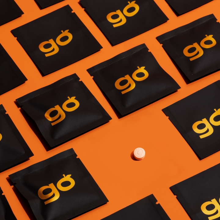
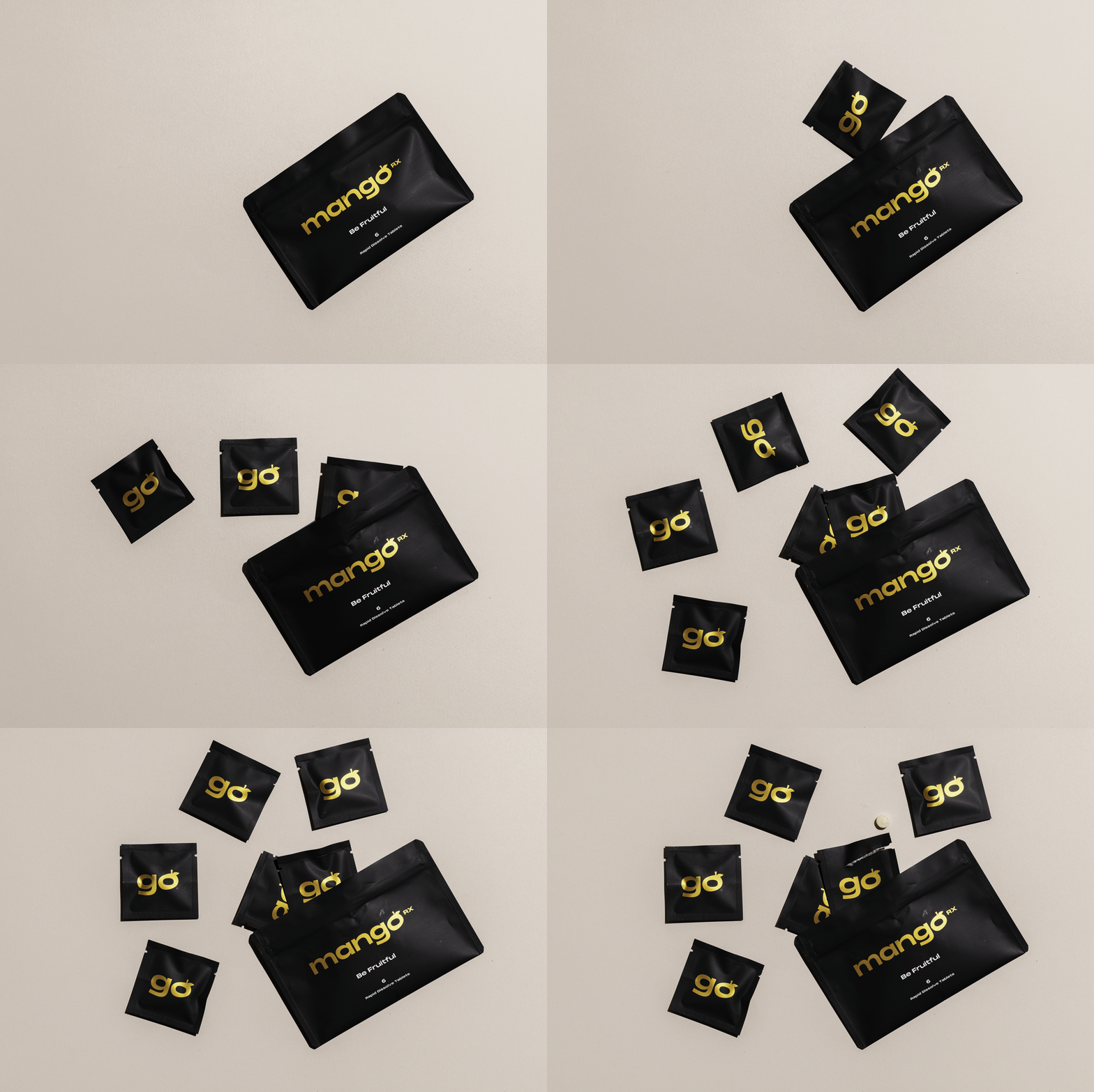
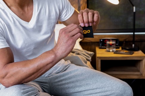
Mango’s packaging screams confidence (quietly). We created a responsive design for how the customers interact with the product, ranging from discreet shipping to individual on-the-go sachets, the package design complements this fast-acting formula’s fit for a modern lifestyle.
Our goal from the outset was to design an elegant website to simplify telemedicine.
With the feel of a standard ecommerce site, customers can easily see prices and clearly understand the product offerings. This approachable shopping experience connects seamlessly to a convenient online medical consultation that subtly simplifies a HIPAA-compliant user experience while looking great at every touchpoint.
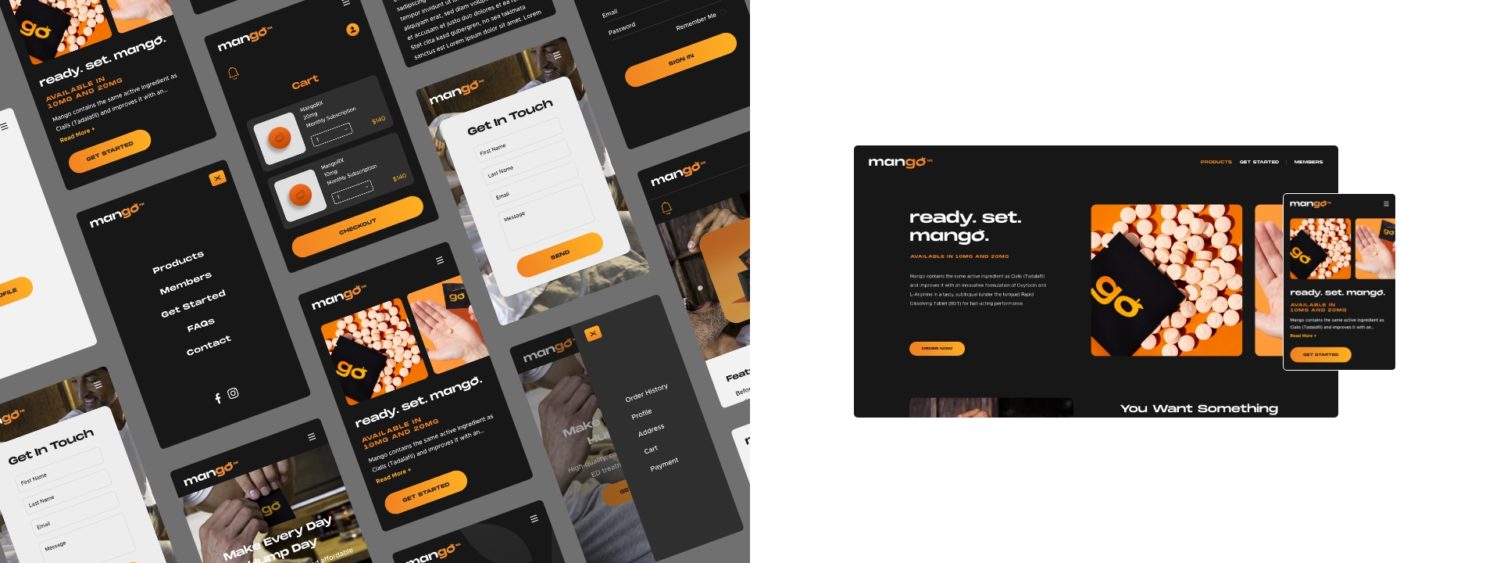

Creative Content & Digital Management
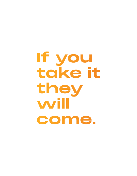
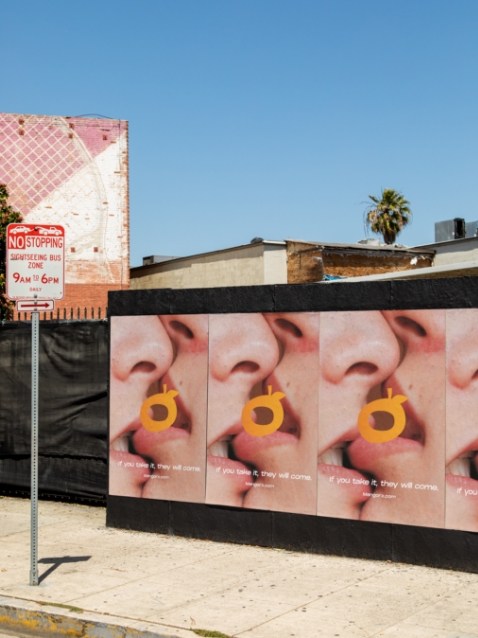
Our approach to content for Mango was to leverage humor and entertainment while weaving in information about men’s health that is accessible. The result: a campaign of bold and bright ads that capture confidence and surely a smile.
Since launch, we have overseen all photography, video, and graphics to live on a multitude of platforms as well as handle the business’ evolving needs.
We’ve been strategic with the content rollout to ensure each new release feels fresh, while also familiar to our audience.
From podcast ads, to influencer videos, sporting events, and online ads—the objective has been to ensure the content is engaging, situationally aware and hard to ignore. We continue to tell the Mango story by leading all outbound marketing and design.
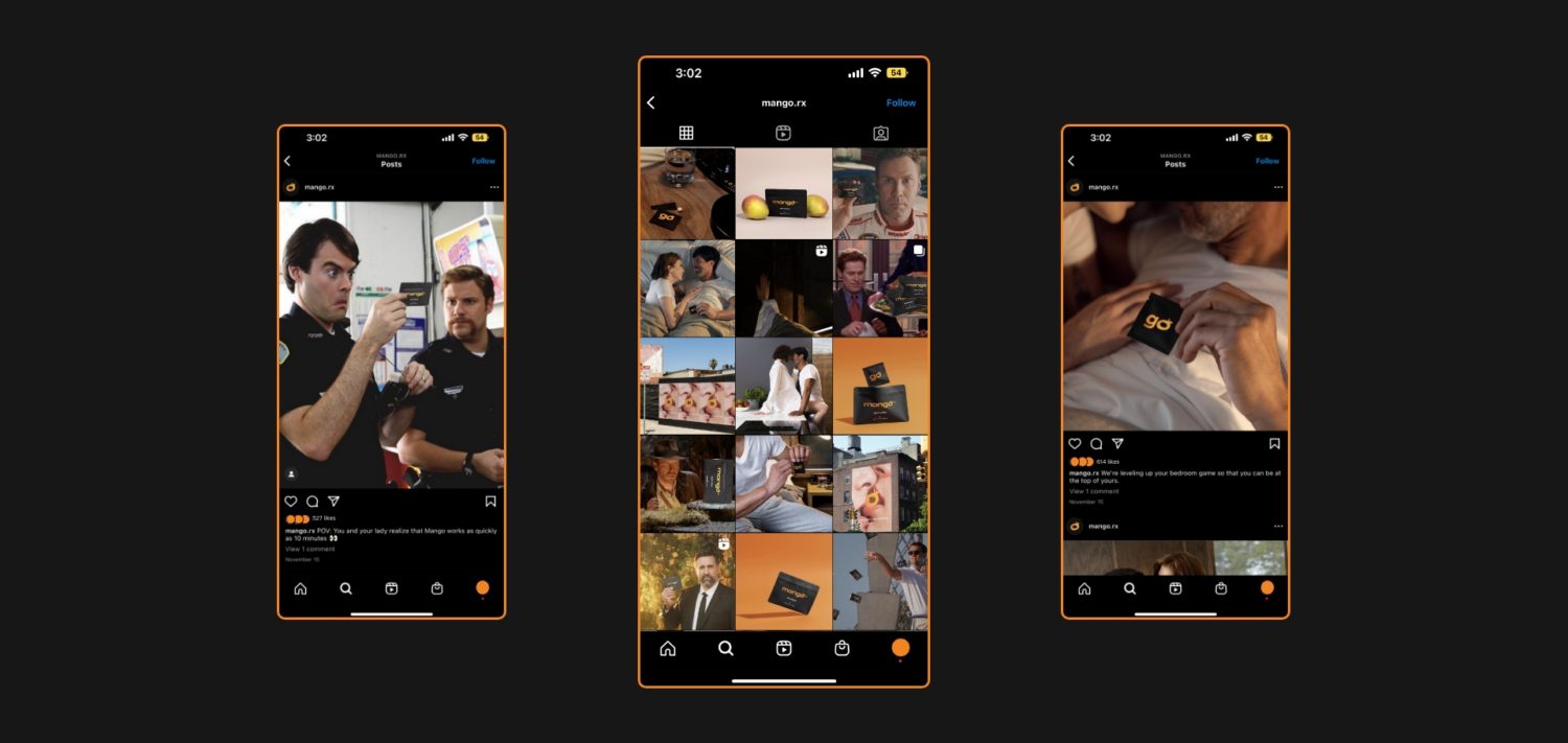



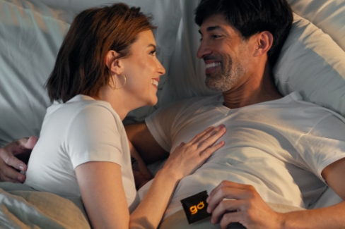
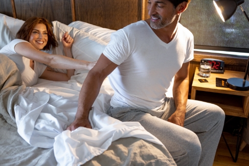
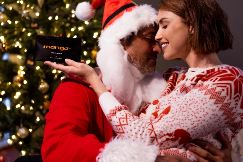
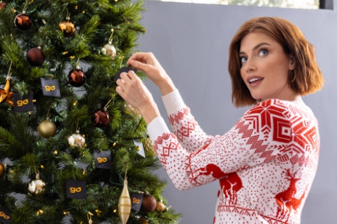
Following Mango’s launch, we approached our First Noel and presented a fresh, on-message campaign of holiday-themed content in digital, OOH, and experiential packages. Not-So-Silent Night was one installation of what we called our “jingle bell” campaign (because we went all the way).
