Hotel Crescent Court
Where the Crown of Uptown Gets Its Polish
The Challenge:
An Institution that Outgrew Its Own Story
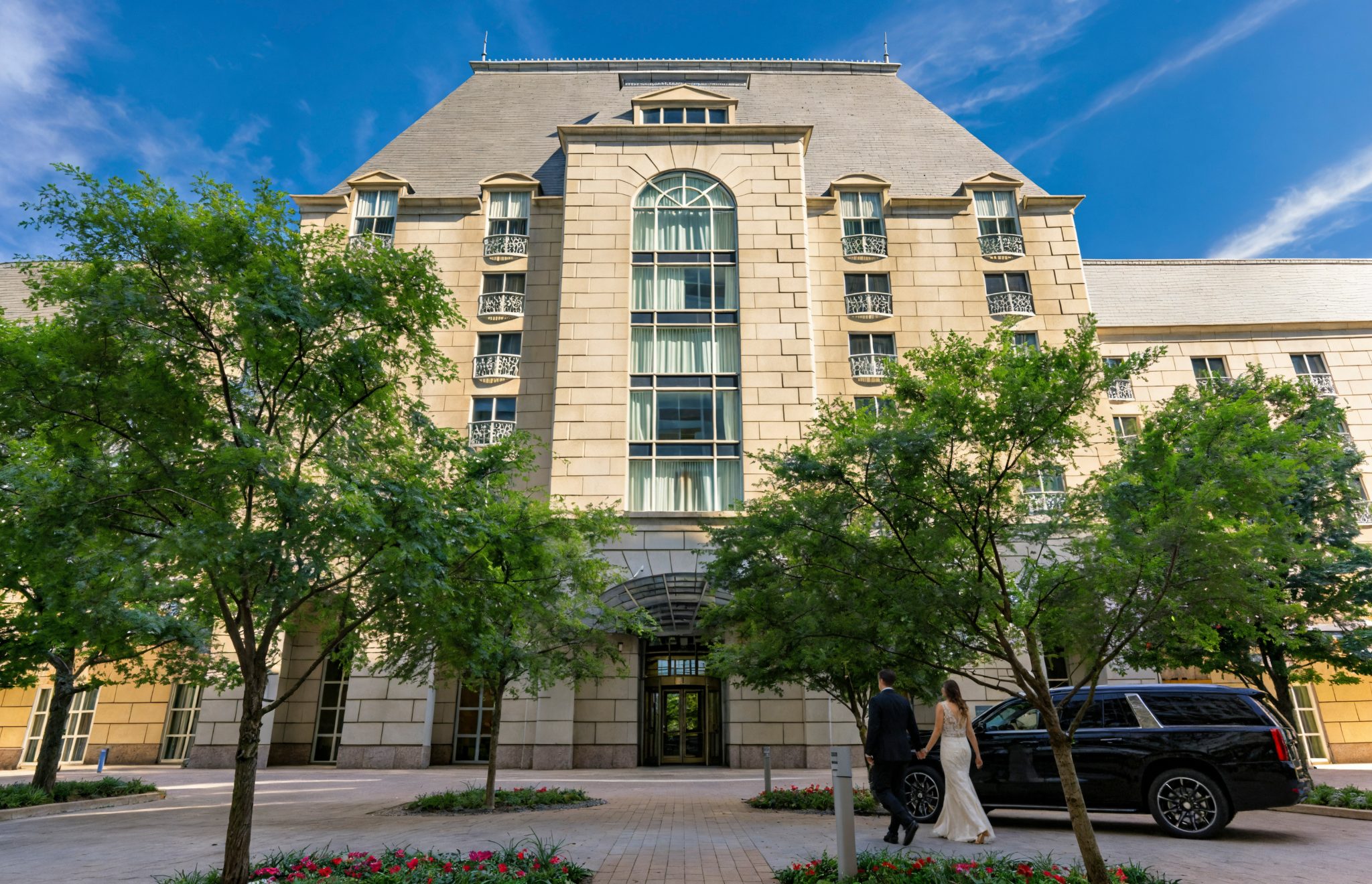
Hotel Crescent Court has been the crown of Uptown Dallas since 1986 — a landmark of French-inspired architecture, genuine Texas hospitality, and quiet prestige. But after a sweeping $33 million renovation, the brand hadn’t kept pace with the property.
The identity had the quiet inconsistencies of time: well-intentioned, but scattered. What the hotel needed was distillation. A brand as considered and cohesive as the property it now inhabits.
Our Approach:
Start with What’s Already True
The best brand work doesn’t manufacture identity, it surfaces what’s already there. Hotel Crescent Court had a clear and compelling character: historic Dallas gravitas, warm Texan hospitality, modern luxury without pretension. Our job was to make that legible.
We built the brand outward from its core — developing the visual system, the voice, and the collateral as a single unified act rather than a checklist of deliverables. Every decision was held to the same standard: Does this feel like the hotel?

Rooms and suites to carry the new identity
226
Property renovation preceding the rebrand
$33M
Year the icon first opened its doors
1986
A monogram as architectural as the building itself
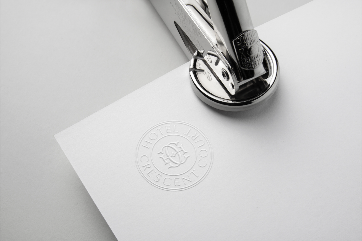
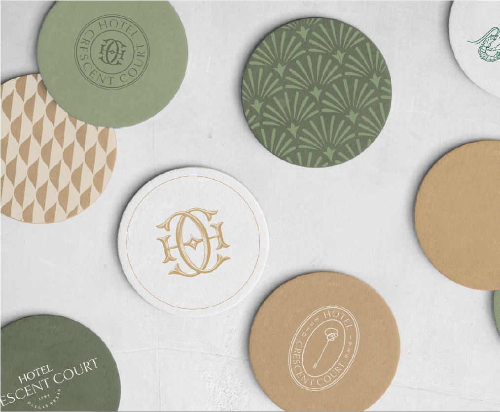
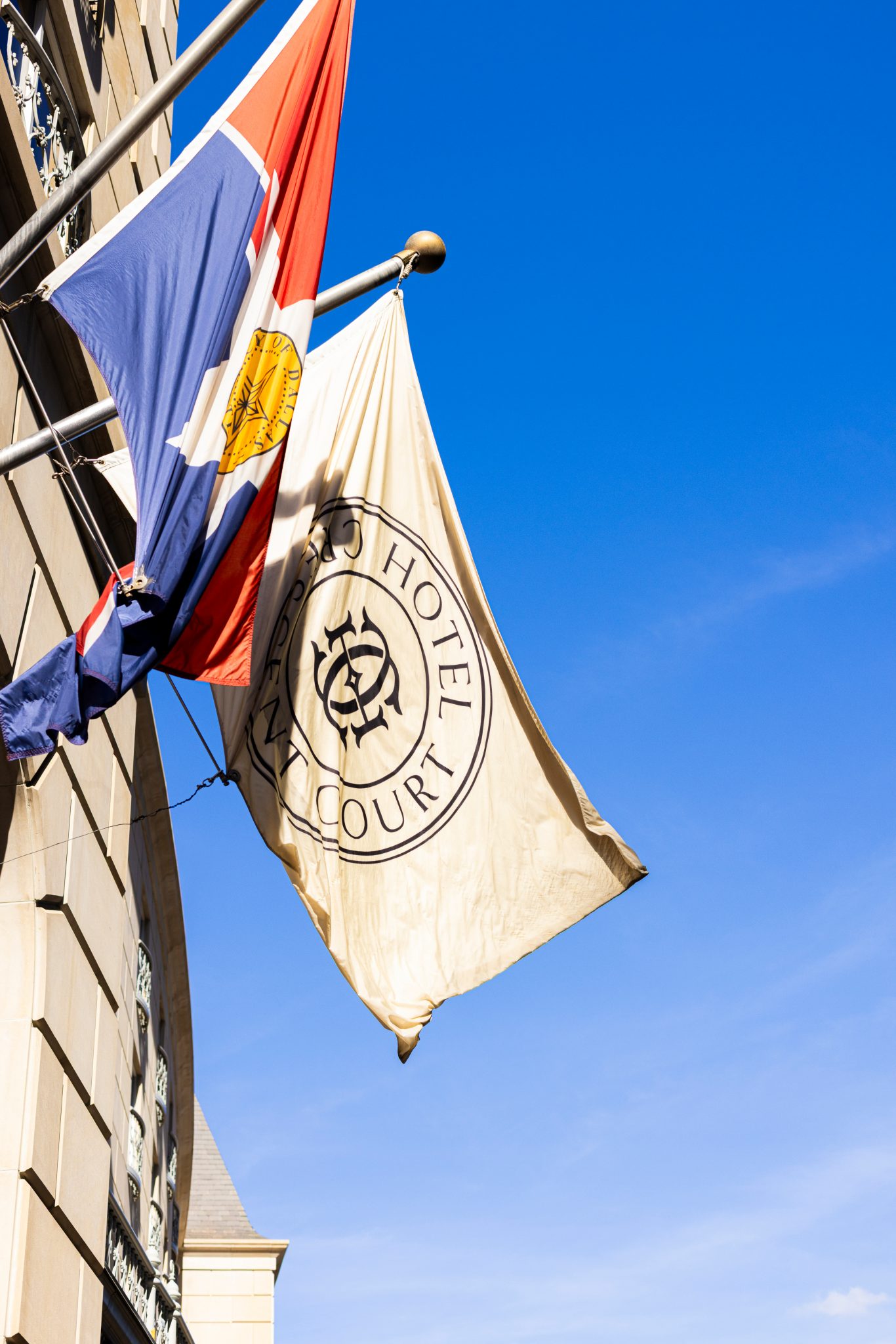
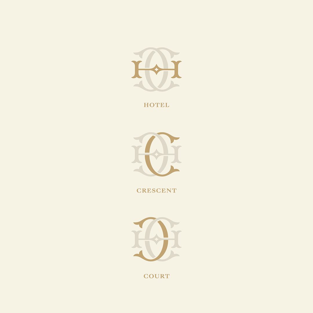
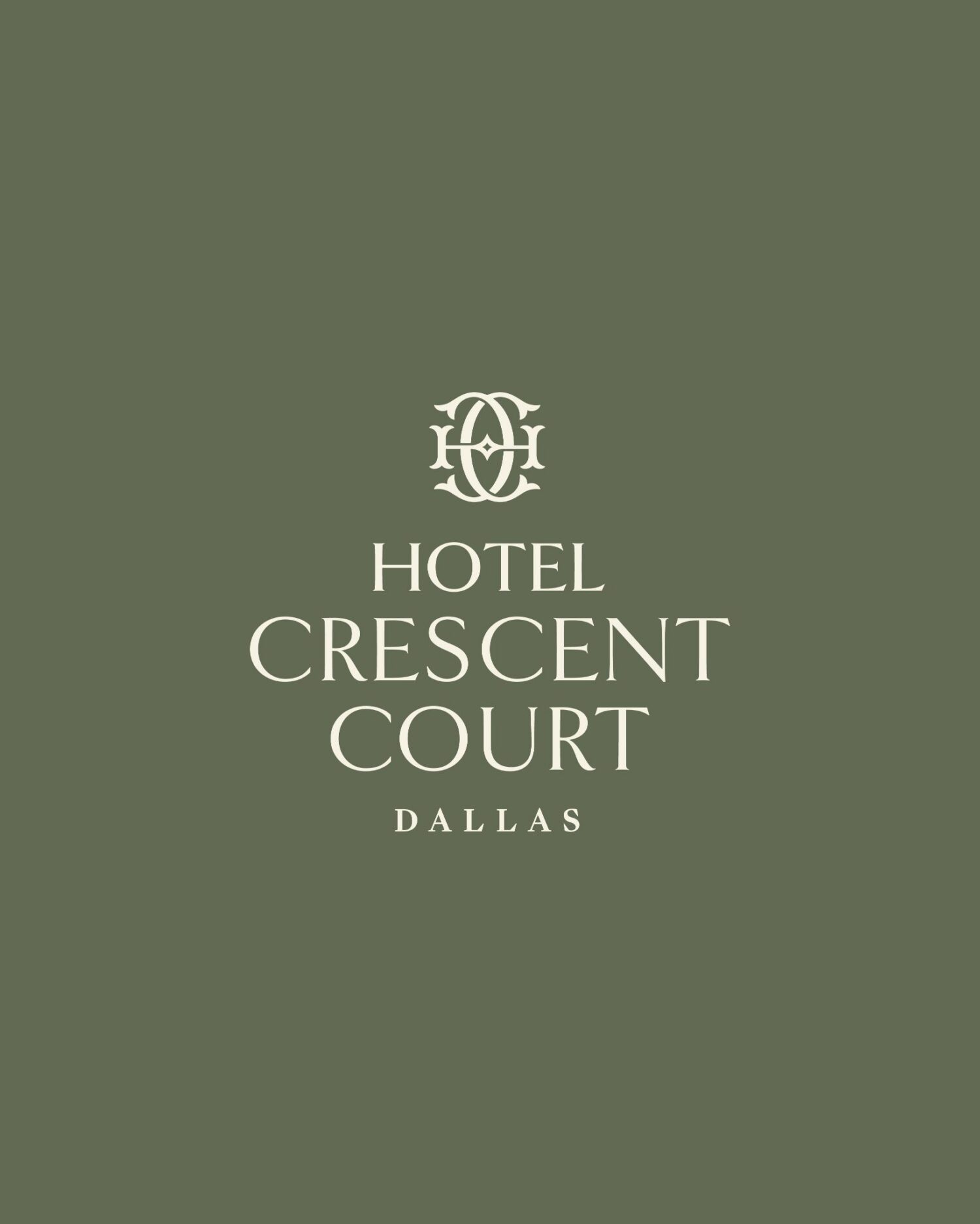
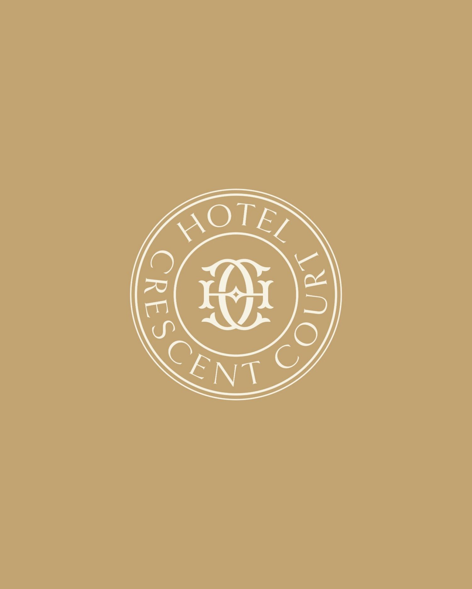
The hotel's identity had always lived in its facade: the French-style balconies, the sweep of the courtyard, the weight of limestone at dusk. We drew directly from that vocabulary for the primary logomark — an HCC monogram pays homage to the building's defining details, as though it always existed,




A palette that feels like the hotel looks
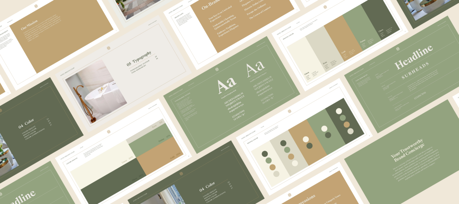
The color system was built from the ground up with atmosphere in mind. Anchoring the brand in warmth and natural texture, the tones of a well-appointed room, and gold threads as an accent of earned luxury.

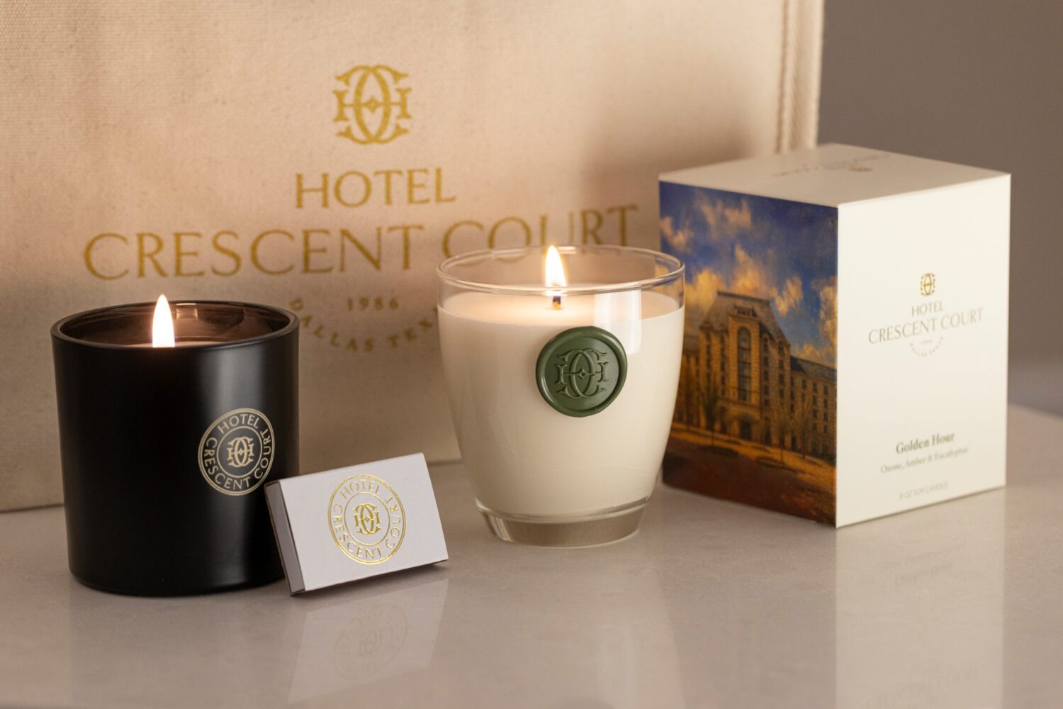
Every touchpoint, consistently considered
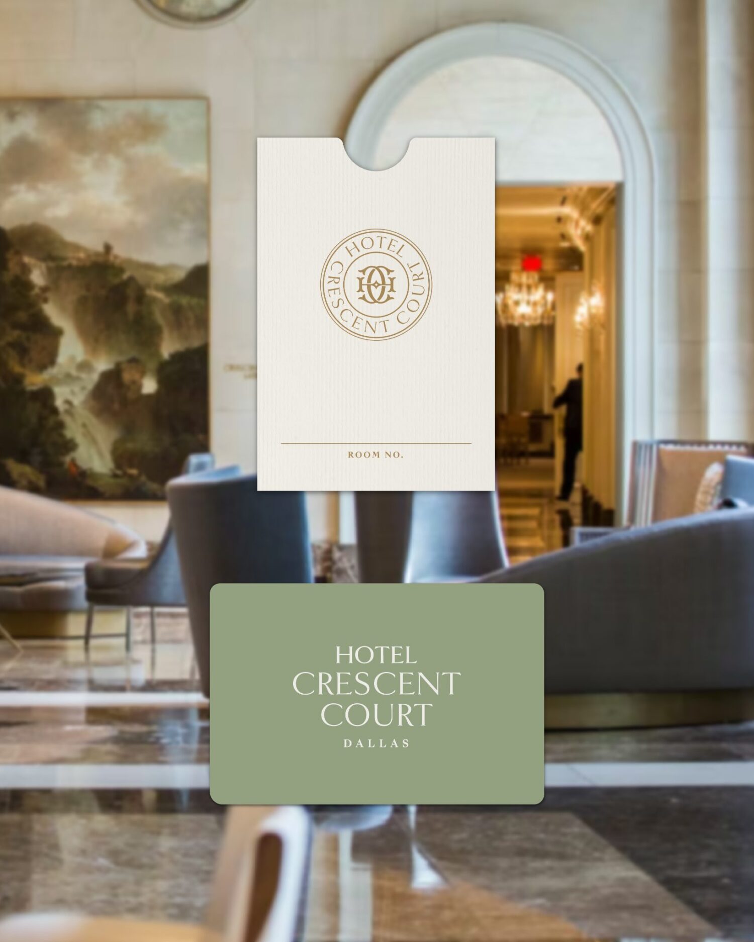
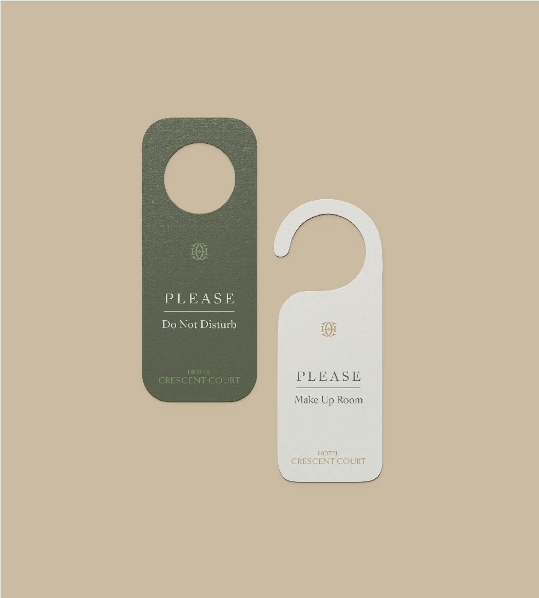
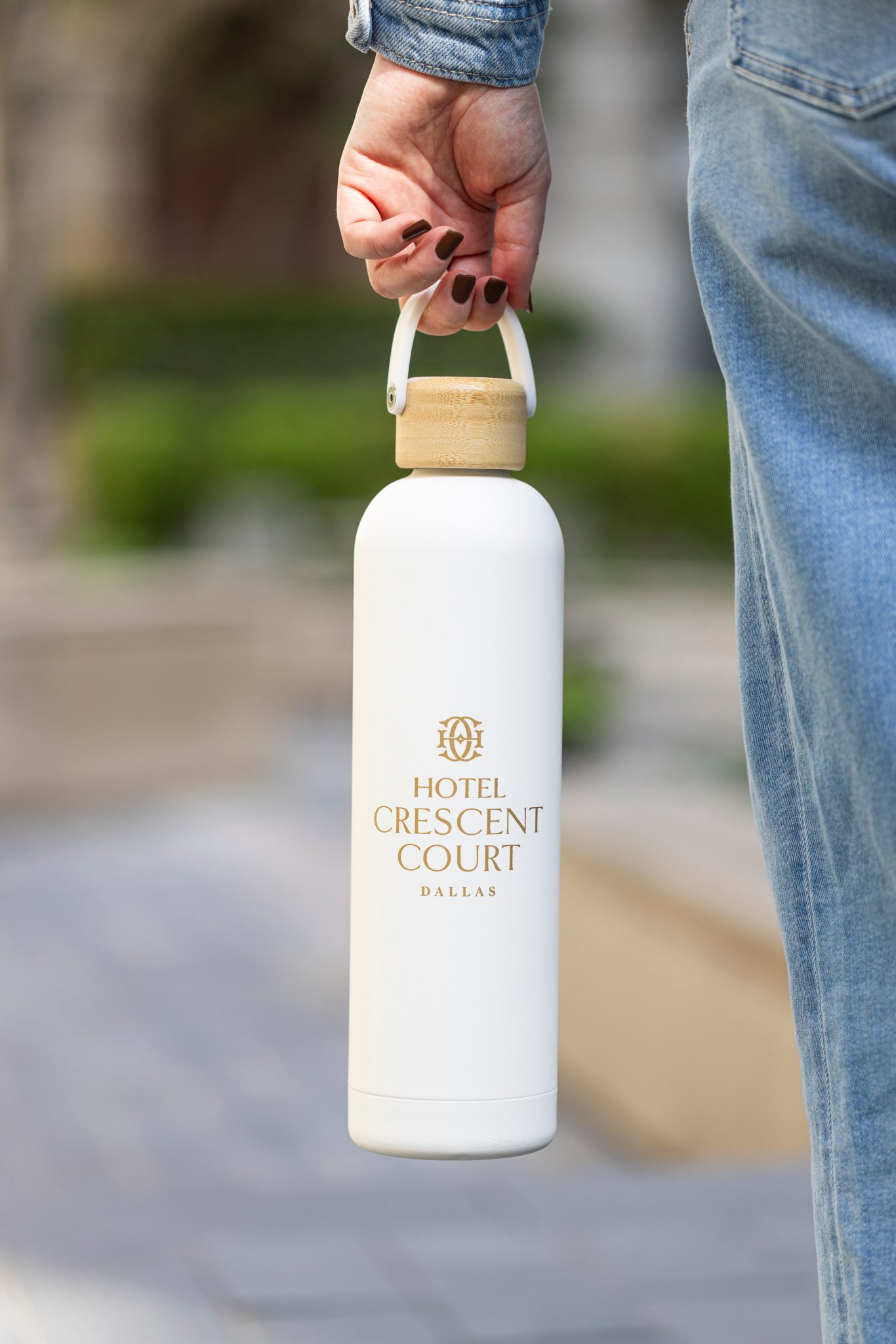
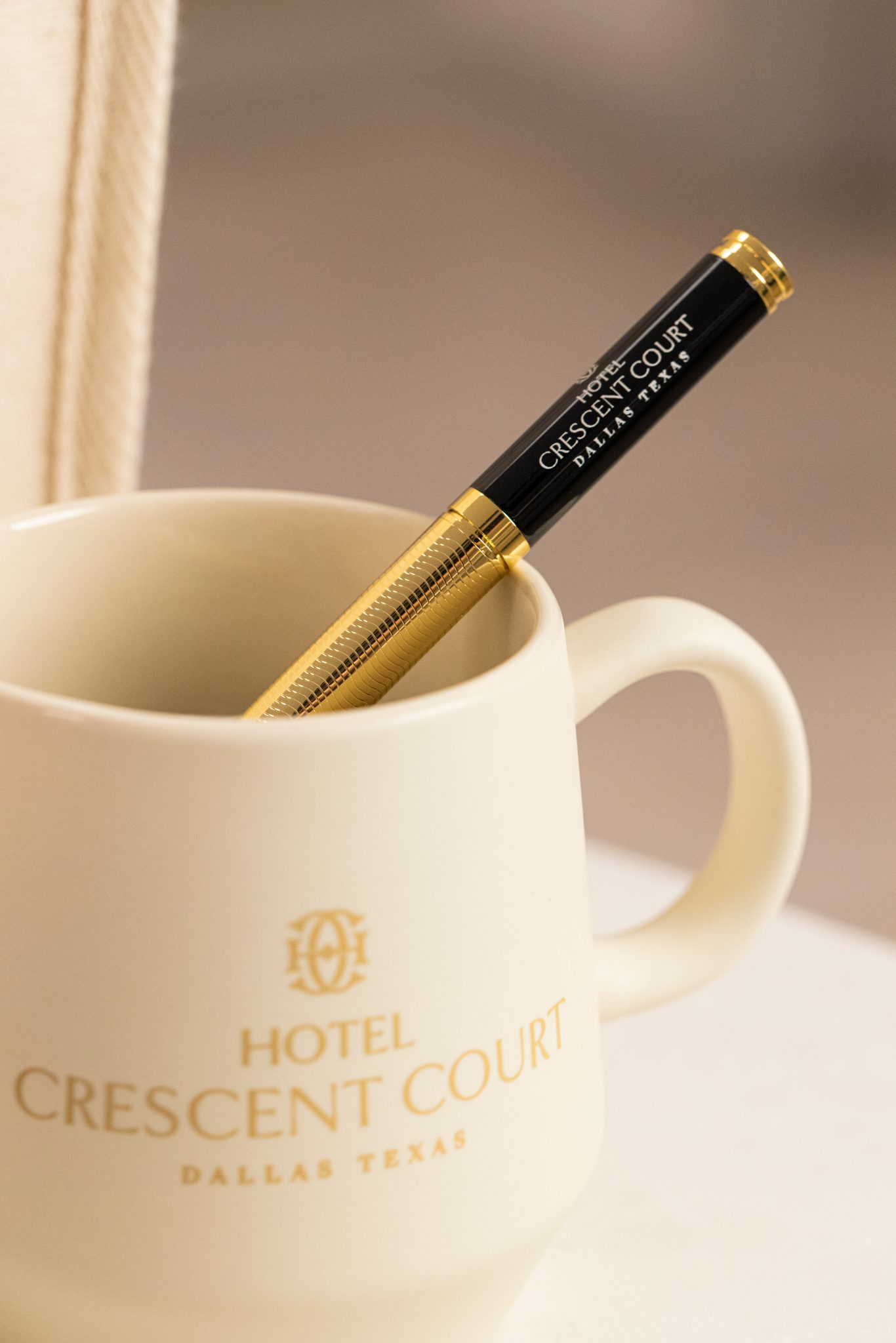
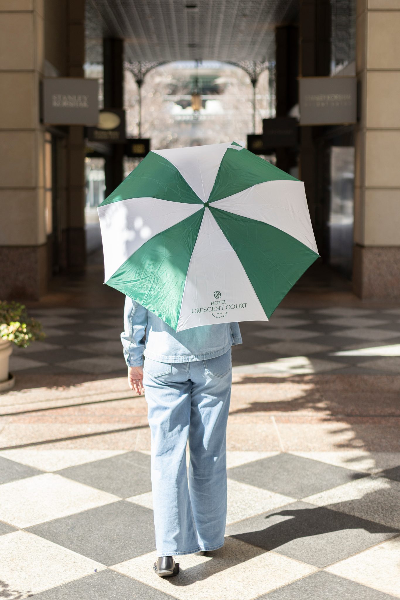
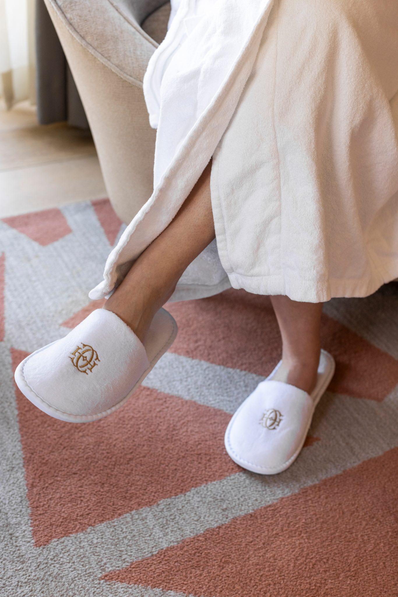
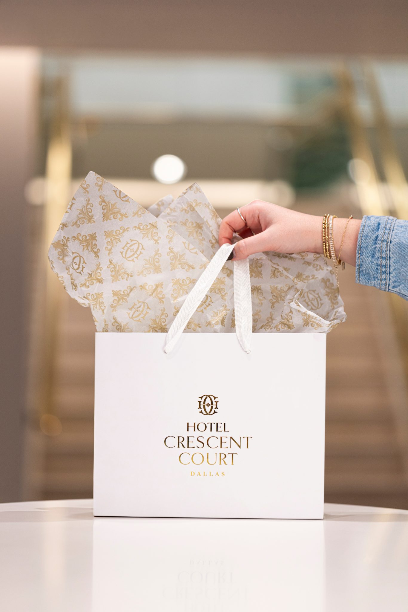
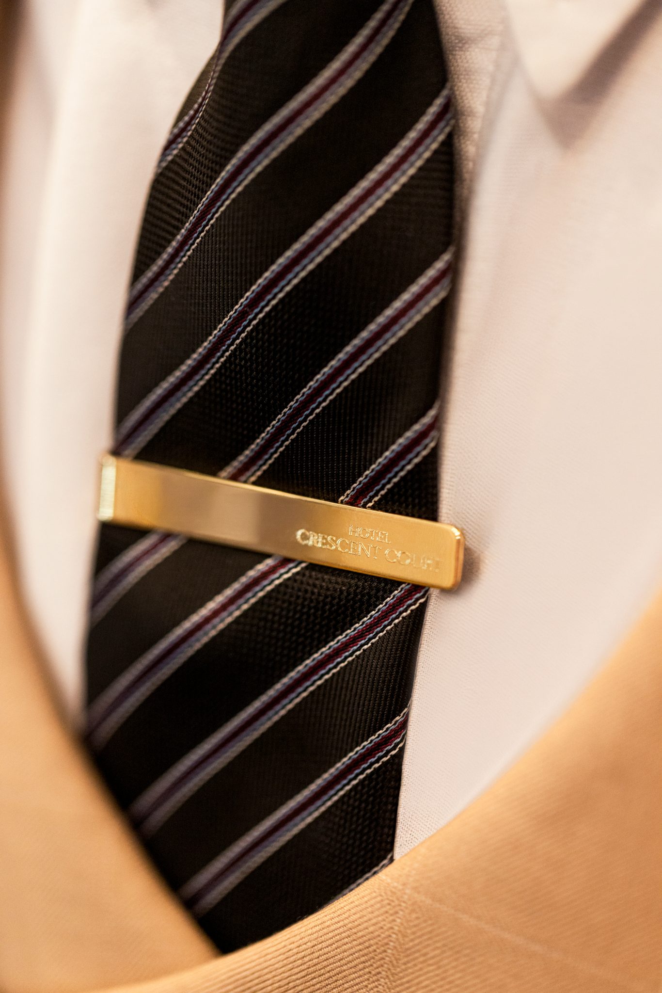
A brand identity earns its value in application: in the weight of an embossed card, the texture of a notepad, the quiet design of a room key. We extended the system across the full suite of in-hotel collateral, ensuring the brand felt intentional at every scale and in every guest's hand.